Top Qs
Timeline
Chat
Perspective
Architype Renner
Geometric sans-serif typeface From Wikipedia, the free encyclopedia
Remove ads
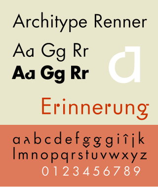
Architype Renner is a geometric sans-serif typeface reproducing the experimental alternate characters of Paul Renner's 1927–29 typeface Futura for the Bauer foundry. Renner's original design for Futura shows the influence of Herbert Bayer's experimental "Universal" alphabet. The alternate characters Renner proposed for Futura were mostly deleted from the face's character set, resulting in a more conventional, and perhaps more economically successful typeface.
This article includes a list of references, related reading, or external links, but its sources remain unclear because it lacks inline citations. (March 2025) |
Alternate characters were drawn for lowercase a, g, and r, and for some punctuation, and uppercase characters including German accents. Both lining and text figures were produced. The Renner Architype typeface is one of a collection of several revivals of early twentieth century typographic experimentation designed by Freda Sack and David Quay of The Foundry.
Remove ads
See also
References
- Blackwell, Lewis. 20th Century Type. Yale University Press: 2004. ISBN 0-300-10073-6.
- Burke, Christopher. Paul Renner: The Art of Typography. Hypen Press: 1998. ISBN 0-907259-12-X.
- Jaspert, W. Pincus, W. Turner Berry and A. F. Johnson. Encyclopædia of Typefaces. Blandford Press; 1983. ISBN 0-7137-1347-X.
- Meggs, Philip. B and McKelvey, Roy. Revival of the Fittest: Digital Versions of Classic Typefaces. RC Publications; 2002. ISBN 1-883915-08-2
- Haley, Allen. Type: Hot Designers Make Cool Fonts. Rockport Publishers Inc, Gloucester; 1998. ISBN 1-56496-317-9
Remove ads
External links
Wikiwand - on
Seamless Wikipedia browsing. On steroids.
Remove ads

