Top Qs
Timeline
Chat
Perspective
Bland–Altman plot
Data visualization From Wikipedia, the free encyclopedia
Remove ads
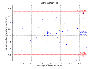
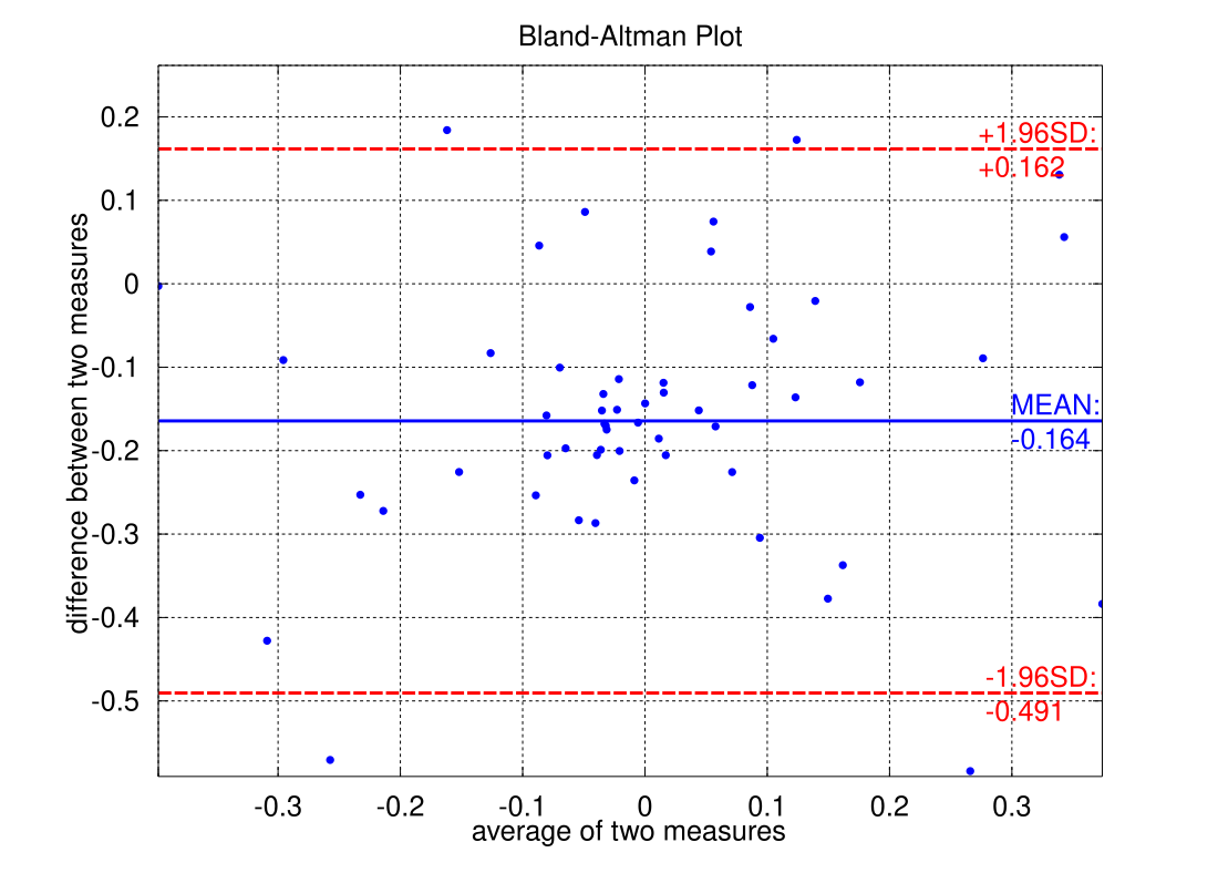
A Bland–Altman plot (difference plot) in analytical chemistry or biomedicine is a method of data plotting used in analyzing the agreement between two different assays. It is identical to a Tukey mean-difference plot,[1] the name by which it is known in other fields, but was popularised in medical statistics by J. Martin Bland and Douglas G. Altman.[2][3]

Remove ads
Construction
Summarize
Perspective
Consider a sample consisting of observations (for example, objects of unknown volume). Both assays (for example, different methods of volume measurement) are performed on each sample, resulting in data points. Each of the samples is then represented on the graph by assigning the mean of the two measurements as the -value, and the difference between the two values as the -value.
The Cartesian coordinates of a given sample with values of and determined by the two assays is
For comparing the dissimilarities between the two sets of samples independently from their mean values, it is more appropriate to look at the ratio of the pairs of measurements.[4] Log transformation (base 2) of the measurements before the analysis will enable the standard approach to be used; so the plot will be given by the following equation:
This version of the plot is used in MA plot.
Remove ads
Interpretation
Summarize
Perspective
Interpretation of a Bland-Altman plot is contingent on the construction of the plot and data at hand. Variations to the default plot have introduced throughout the years and each should be interpreted accordingly.[5]
Original Construction
The original plot displays a scatter plot of differences between individual data points. The differences should be of the new reference system minus a gold standard.[3] An average of the differences is plotted horizontally with limits of agreement plotted parallel to this mean difference line. The limits of agreement represent a confidence interval for which most of the differences lie between systems. The mean difference represents a general bias between the two systems; a positive mean difference indicates the reference system generally produces larger values relative to the golden standard, and a negative mean difference indicating the reference system generally produces lower values than the verified system.[3] A mean difference close to 0 indicates agreement between two systems, though the limits of agreement illustrate more nuance.
Limits of Agreement
Since the limits of agreement are by-default contingent on the standard deviation of the data, the distribution of the differences must follow a normal distribution. In the event that the distribution of differences are not normal, limits of agreement not contingent on normal distribution may be used instead. Bland and Altman's follow up paper on the topic explains that percentile of differences are a suitable replacement in such cases.[4]
In any case, the limits of agreement more accurately illustrate the agreement between systems as opposed to just the mean difference. A novel reference system is said to be an appropriate substitute for a golden standard system if the limits of agreement are within a predetermined threshold. The threshold depends extensively on the magnitude of the data, the nature of the systems, and the contexts in which they are to be used.[6]
The 95% limits of agreement can be unreliable estimates of the population parameters especially for small sample sizes so, when comparing methods or assessing repeatability, it is important to calculate confidence intervals for 95% limits of agreement. This can be done by Bland and Altman's approximate method [3] or by more precise methods.[7]
Sample Size and Power Estimation
Determining an adequate sample size is a key consideration in Bland–Altman analysis, as it influences the precision of the estimated limits of agreement and the statistical power to detect clinically meaningful differences between measurement methods. Historically, there has been limited formal guidance on how to perform power or sample size calculations for Bland–Altman studies. Early recommendations by Martin Bland suggested estimating sample size from the expected width of the confidence interval for the limits of agreement, an approach that does not explicitly account for Type II error and may yield insufficient sample sizes for typical study designs.[8]
A more rigorous approach was later introduced by Lu et al. (2016), who proposed a statistical framework for assessing power and determining sample size based on the distribution of measurement differences and predefined limits of clinical agreement.[9] Their method explicitly incorporates Type II error control and provides more accurate estimates of required sample sizes for studies targeting a given statistical power, typically 80%. Simulation studies in that work demonstrated good performance of the method under practical conditions; however, the authors did not provide publicly available software to implement the approach.
Several software packages now include implementations of the Lu et al. methodology. The commercial MedCalc statistical software provides sample size and power estimation tools for Bland–Altman analyses.[10] In addition, an open-source implementation is available in the R package blandPower, which provides functions to estimate power curves, determine required sample sizes, and visualize confidence interval widths as a function of sample size. The blandPower package was developed to promote reproducibility and accessibility of power and sample size calculations for method comparison studies using the Bland–Altman framework.
Visualization Variations
In the case that the differences grow proportionally to the magnitude of the data, then the data is said to have a 'proportional bias'. There are many methods for visualizing the plot and subsequent analysis to accommodate for it.[11]
Firstly, a linear regression could illustrate any relevant trends. If the distribution of differences are equal at all points around the regression the data is said to be homoscedastic and the trend is a simple proportional bias. Inversely, if the data has wider spread at different magnitudes of the data, then the differences are said to be heteroscedastic, which has further implications. Statistical tests such as the Breusch–Pagan test or the White test can provide statistical indicators of heteroscedasticity.

One typical example of a plot with heteroscedastic data is one whose variation of differences grows proportional to the magnitude of the data, visualized as an expanding 'v' shape.[11] In such cases, it may be suitable to visualize the proportion of data points between systems as opposed to the raw differences.[12] Similarly, the plot of differences could be visualized logarithmically.[11] In either case, the relationship between the two systems illustrates a multiplicative relationship as opposed to linear one. This also indicates that the magnitude of the data correlates with variations of accuracy for the systems.
Remove ads
Application
One primary application of the Bland-Altman plot is to compare two clinical measurements that produce continuous output.[13] It can be used to compare a new reference system, technique, or method with a verified gold standard, but a gold standard does not imply it to be without error.[4]
In order for the plot to be used to verify a reference system, a threshold is typically predetermined for which the limits of agreement must fall under. The value for the threshold is contingent on a myriad of contexts in which the systems and data exist within.[6]
The ability to verify a reference system lends the plot to a broad applicability and prominence across many fields. Over the years, it has gained prominence in Optometry, nutritional science, radiology, environmental sciences, surgery, medicine, veterinary medicine, engineering, and psychology, to name a few.[6][14][15][16][17][18] Many recommendations and scholarly articles have also been published in efforts of polishing the technique, the underlying statistical construction, and validity of the plot.[19][20]
See Analyse-it, MedCalc, NCSS, GraphPad Prism, R, StatsDirect, or JASP for software providing Bland–Altman plots.
See also
Notes
A similar method was proposed in 1981 by Eksborg.[21] This method was based on Deming regression—a method introduced by Adcock in 1878.
Bland and Altman's Lancet paper [3] was number 29 in a list of the top 100 most-cited papers of all time with over 23,000 citations.[22]
References
Wikiwand - on
Seamless Wikipedia browsing. On steroids.
Remove ads


