Top Qs
Timeline
Chat
Perspective
Iowan Old Style
Typeface From Wikipedia, the free encyclopedia
Remove ads
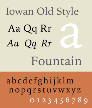
Iowan Old Style is a digital serif typeface designed by John Downer and released by Bitstream in 1991.[1]
Iowan Old Style is inspired by serif typefaces from Renaissance Italy, now called the “old-style” or Venetian model of typeface design, with influence from Downer’s work as hand-painter of signs.[2][3][4]
Compared to the historical models it is based on, Iowan has a higher x-height, meaning that the lower-case letters are taller and appear larger and wider, producing a design that is suitable for display and on-screen use.[5] It is used as a default font on the Apple Books application and is included as a system font on iOS and macOS.[6][7]
Remove ads
Design
Downer has described the design "more Venetian than Aldine" and influenced by lettering.[4] It has diamond-dots (tittles) on the “i” and “j” similar to the Arts and Crafts-influenced Goudy Old Style.[1]
Iowan began as a design for ITC, but after the company dropped plans to release it, the font was bought up by Matthew Carter of Bitstream, who digitized and released it.[4] Bitstream later revisited the design, adding ornaments and titling capitals.[1] The character set includes small capitals and ligatures, as well as Cyrillic characters. Stephen Coles, an expert on digital fonts, describes its design as “hardworking.”[8]
Remove ads
Gallery
- An extended setting of a text by Oscar Wilde in Iowan Old Style, showing justified text and leading between the lines.
- Iowan Old Style’s x-height compared to other serif fonts: higher than Caslon and Bembo, used in fine book printing, but lower than Lucida Bright which is intended for maximum legibility.
References
External links
Wikiwand - on
Seamless Wikipedia browsing. On steroids.
Remove ads


