Top Qs
Timeline
Chat
Perspective
Peignot (typeface)
Typeface From Wikipedia, the free encyclopedia
Remove ads
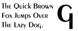
Peignot is a sans-serif display typeface, designed by the poster artist A. M. Cassandre in 1937.[1] It was commissioned by the French type foundry Deberny & Peignot.[2]
This article needs additional citations for verification. (December 2009) |
The typeface is notable for not having a traditional lowercase, but in its place a "multi-case" combining traditional lowercase and small capital characters.[2] Cassandre intended for Peignot to be used in publishing and stated that "[t]here is no technical reason in printing why we cannot return to the noble classical shapes of the alphabet and discard the lower case forms."[1]
The typeface achieved some popularity in poster and advertising publishing from its release through the late 1940s. Stylistically Peignot is a "stressed" or modulated sans-serif in the Art Deco style, in which the vertical strokes are clearly wider than the horizontals. Use of Peignot declined with the growth of the International Typographic Style, which favored less decorative, more objective, traditional typefaces such as Akzidenz-Grotesk.
As of 2023,[update] Production Type holds the rights to Peignot and has digitized the font.[3]
A very similar typeface, Chambord by Roger Excoffon, was released by the Fonderie Olive in Marseille in 1945; it had a traditional lowercase.[2] A font resembling Peignot was used for the Intellivision video game system. Derek Vogelpohl distributes a digital version of that font as freeware under the name SF Intellivised.
Remove ads
See also
References
Wikiwand - on
Seamless Wikipedia browsing. On steroids.
Remove ads


